Allen Tate —
Partner Office Marketing
Brand Identity & Marketing Suite Design | Print + Digital Collateral
Role: Lead Graphic Designer | Year: 2023-2024

Overview
Allen Tate’s Partner Office Marketing program was designed to strengthen the visibility, professionalism, and brand consistency of its affiliated offices across the region. As the lead designer, I developed a comprehensive suite of assets that spanned both print and digital channels. From business cards to physical signage, every element was crafted to reflect Allen Tate’s reputation for excellence while allowing each office to establish a polished, unified presence in their local market.
Objectives:
To create an adaptable, branded visual system that:
-
Reinforced Allen Tate’s identity across partner offices
-
Supported agents and leadership with customized marketing tools
-
Enhanced the client experience from first touchpoint to closing
-
Maintained visual consistency across all locations and asset types

Research & Strategy
This project required balancing a large-scale brand system with the nuanced needs of individual offices and agents. Each partner office had its own market, staff, and physical footprint, yet every touchpoint needed to reflect Allen Tate’s polished and trustworthy brand identity. The strategy was rooted in building scalable, professional design systems that could adapt across offices, agents, and platforms without sacrificing cohesion.
Brand Uniformity vs. Local Adaptation
To address the challenge of unifying dozens of offices, I began by conducting a comprehensive audit of existing marketing materials. This revealed inconsistencies in layout, logo usage, and brand tone. I used this insight to develop a foundational visual framework—one that preserved the Allen Tate brand integrity while enabling local customization.
Human-Centered Design
Understanding how different team members (agents, admins, managers) used marketing tools in their day-to-day work helped shape the design approach. Materials had to be intuitive to personalize, easy to distribute, and professional enough to represent both the agent and the brand. I created editable templates with locked brand elements and flexible input areas, making them both user-friendly and foolproof.
Multi-Channel Scalability
Each asset had to perform across different formats—print, digital, social, and on-site displays—so I focused on clean, modular design systems. Typography, spacing, and hierarchy were meticulously tested for clarity in both screen and physical environments. A consistent grid system and reusable design motifs ensured seamless brand translation between mediums.
Elevating Client Experience
I also considered how these materials would be experienced by clients—from the moment they walked into an office to when they received a follow-up email or postcard. The design system focused on projecting confidence, clarity, and warmth. From signage to stationery, every element was designed to build trust and reinforce Allen Tate’s reputation for excellence.
Collaboration & Iteration
As the lead designer, I worked directly with office managers, marketing coordinators, and agents to gather feedback throughout the process. This collaborative model helped ensure that the final materials were not only beautiful, but also practical and embraced by the people using them every day.

Target Audience & Personas
Understanding the needs of both internal stakeholders and external clients helped me design assets that were not only beautiful but highly functional. From personalized postcards for agents to signage that welcomed visitors, every piece was informed by how and where it would be used and by whom. This user-first approach helped guide layout decisions, font sizing,
and even print finishes.

1. The Local Office Leader
Demographic: Partner Office managers and marketing staff
Needs: Professional, branded materials to support recruitment and client outreach
Design Consideration: High-quality print materials, branded signage, editable formats for ongoing use

2. The Prospective Client
Demographic: Homebuyers and sellers interacting with
office materials
Needs: Clarity, consistency, and trust at every step
of the experience
Design Consideration: Clean design, easy-to-read contact info, branded professionalism that builds confidence
1. Conceptualization
The initial phase of the project was dedicated to understanding the existing landscape of Allen Tate Partner Office materials and ensuring alignment with the overarching brand guidelines. This involved a thorough review and analysis of all existing materials.
-
Material Review: I meticulously reviewed all existing office materials, including website banners, email signatures, postcards, business cards, social media graphics, and physical signage. This review aimed to identify inconsistencies, gaps in design, and opportunities for improvement. The goal was to understand how the brand was currently being represented across different partner offices and identify areas where standardization and enhancement were needed.
-
Consistency Gaps and Opportunities: The review process highlighted several key areas for improvement. Inconsistencies in font usage, color application, and logo placement were common. There was also a lack of a unified visual language across different materials, leading to a fragmented brand experience. Opportunities were identified to create a more cohesive and professional brand presence through standardized templates and design guidelines.
-
Brand Guideline Review: To ensure fidelity across all formats, I revisited Allen Tate’s brand guidelines. This involved a deep dive into the documented standards for logo usage, color palettes, typography, imagery, and overall brand voice. The purpose was to ensure that all design decisions were aligned with the core brand values and visual identity.
-
Alignment with Core Values: The brand guideline review ensured that all design work would reflect Allen Tate's core values of integrity, community, and excellence. This alignment was crucial for maintaining a consistent and trustworthy brand image across all partner offices.
.png)
2. Asset Planning
Following the discovery and research, the next step was to develop a robust design system that would streamline the creation of future materials and ensure consistency across all partner offices.
-
Visual Framework Creation: I established a visual framework for recurring materials, which included defining consistent margins, color usage, and font hierarchy. This framework served as a foundation for all subsequent design work, ensuring a unified look and feel across different formats.
-
Icon and Graphic Library: To enhance visual communication and streamline the design process, I developed an icon and graphic library that could be reused across campaigns and content types.

3. Execution
With the visual framework and asset library in place, I moved on to the production of a wide range of assets for Allen Tate Partner Offices.
Assets Designed
The following are examples of the types of assets that are typically designed for Allen Tate's Sports Partner Marketing initiatives:
-
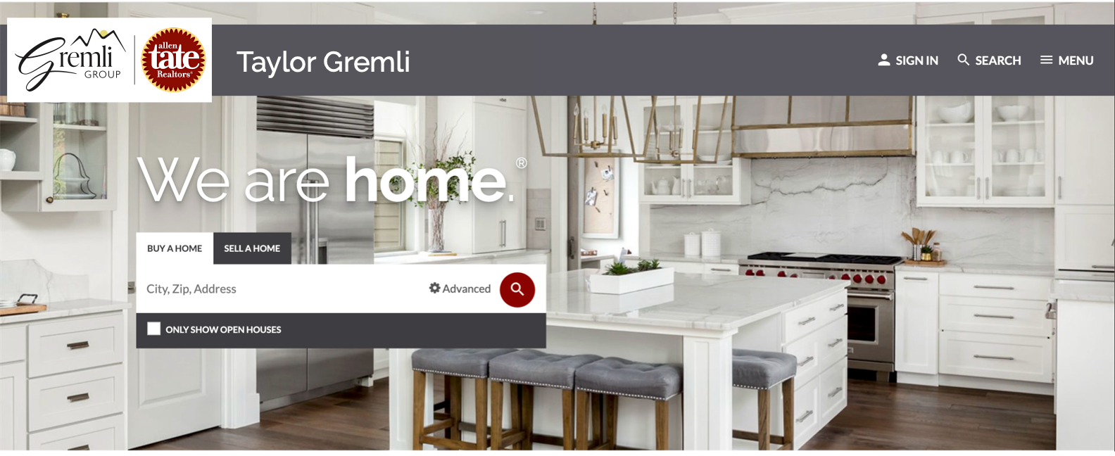
Site Banners: Designed hero graphics and promotional headers for partner websites. These banners were visually appealing and aligned with the overall brand aesthetic, enhancing the online presence of each office.
-
Email Signatures: Created clickable, mobile-responsive email signatures for agents and leadership. These signatures included essential contact information and branding elements, ensuring a professional and consistent communication experience.
-
Postcards & Stationery: Developed templates for office announcements, direct mail, notepads, letterhead, and folders. These templates were designed to be easily customizable, allowing each office to create branded materials that met their specific needs.
-
Business Cards: Customized business cards for agents and managers with clean, modern layouts. These cards were designed to be visually appealing and easy to read, reflecting the professionalism of the Allen Tate brand.
-
Social Media Graphics: Branded templates for office achievements, recruiting, and agent spotlights. These graphics were designed to be engaging and shareable, helping to promote the office and its agents on social media platforms.
-
Blog Graphics: Created headers and inline visuals to support content marketing efforts. These graphics enhanced the visual appeal of blog posts and helped to communicate key messages effectively.
-
Logos: Designed custom partner office sub-brand logos, aligned with main brand standards. These logos allowed each office to maintain its unique identity while still being clearly associated with the Allen Tate brand.
-
Physical Signage: Designed interior and exterior signage, office directional graphics, and branded displays. This signage helped to create a welcoming and professional environment for clients and employees.
-
Office Photography: Art-directed photography sessions for web and promotional use. These sessions captured high-quality images of the office space, agents, and staff, which were used to enhance the visual appeal of websites and marketing materials.
Through this comprehensive design process, I ensured that Allen Tate Partner Offices had access to a wide range of high-quality, branded materials that enhanced their visual identity and supported their marketing efforts. The focus on consistency, efficiency, and brand fidelity resulted in a cohesive and professional brand presence across all partner offices.


Outcomes:
-
Established a unified, professional identity across all partner offices
-
Streamlined internal marketing workflows with ready-to-use templates
-
Improved agent and manager access to high-quality, on-brand collateral
-
Strengthened Allen Tate’s market presence through consistent,polished touchpoints
Reflections:
This was one of the most rewarding projects I’ve led. It allowed me to work across a wide variety of formats and really think about design as a service tool for both internal and external users. Seeing the materials in use across dozens of offices was a proud moment and a strong reminder of the power of consistent branding.